Create your profile, save bookmarks & likes
hoverstate.design

16 Best Startup Website Designs in 2026

Startup websites have to do more work per pixel than any other site type. No brand recognition, no sales team, no time. These 16 examples from developer tools, AI products, B2B SaaS, and consumer apps each solve a specific design and positioning challenge worth studying.

By Shahriyar Ishmam · Last updated: October 2026 · 16 startups reviewed

Developer tools

1.Cursor

The AI code editor

Visit →

Cursor's site is a masterclass in developer trust-building. The headline is blunt and specific: 'The AI Code Editor.' No jargon about 'intelligent assistance' or 'copilot-powered workflows.' A product video plays above the fold. The site grew through word of mouth and the homepage reflects that confidence — it doesn't try to convince you, it just shows you.

Lesson: Specific, bold headline for a product with genuine word of mouth. Don't oversell what the product is already selling itself.
Warp

2.Warp

The intelligent terminal

View on Hoverstate →

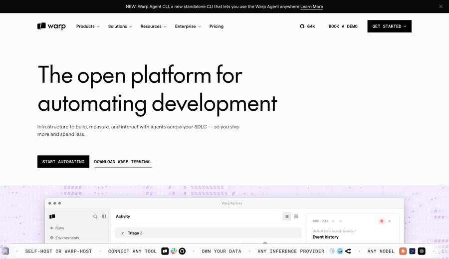
Warp entered an unsexy product category (the terminal) and made it feel premium. The hero shows the terminal itself — syntax highlighting, block-based history, AI command completion. The site is dark and developer-confident. The 'Before / After' scroll comparison on the page is one of the most effective feature demo patterns used by any startup.

Lesson: Before/after comparison scroll for a product replacing a default tool — makes the improvement visceral

3.Railway

Infrastructure, instantly

Visit →

Railway's site communicates speed through its design — minimal layout, immediate CTA, no sales friction. The dashboard preview in the hero shows a clean deployment view. The pricing page is one of the clearest in infrastructure SaaS: usage-based, no hidden fees, legible at a glance.

Lesson: Speed as brand identity, usage-based pricing transparency, deployment dashboard hero

4.Fly.io

Deploy app servers close to your users

Visit →

Fly.io has a distinct writing voice — direct, technical, slightly irreverent. The site feels like it was written by engineers for engineers. The globe showing global deployment regions is a direct visual argument for the product's value (latency). Docs are prominently linked in the hero.

Lesson: Distinct writing voice as brand identity, geographic visualization for a latency product

AI & creative tools

5.Perplexity

Ask anything

Visit →

Two words, immediately followed by a search box. No hero paragraph, no explainer. The product is the landing page — you can search before you sign up. This is the boldest homepage-as-product pattern on this list: if you need a description, you're not the target customer.

Lesson: Product-as-homepage, instant value before sign-up, two-word headline for a search product

6.ElevenLabs

The most realistic AI voice platform

Visit →

ElevenLabs lets you play AI voice demos directly in the hero. Sound is the product, so sound is in the hero. The demo selector (different voices, styles, languages) lets the product qualify itself for different use cases without a feature table. The superlative headline ('most realistic') is backed by the audible proof.

Lesson: Product demo in the hero that's interactive, not passive — qualify buyers through the experience

7.Midjourney

An independent research lab exploring new mediums of thought

Visit →

Midjourney's site is almost anti-marketing. The homepage is a gallery of generated images with minimal copy. The product generates the content that sells the product. The strange, exploratory tagline signals a mission-driven organization rather than a typical startup — which is exactly the brand they've built.

Lesson: Product output as hero content, brand identity through mission language over feature language

8.Runway

Tools for human imagination

Visit →

Runway's site is a film reel. Generated video plays on a loop, and the quality of the output sells the product more effectively than any copy. The aesthetic is cinematic — dark, full-bleed, high-motion. Runway is building for creative professionals and the site looks like it was made by creative professionals.

Lesson: Full-bleed video demo, cinematic aesthetic for a creative-professional product

B2B SaaS

9.Liveblocks

Collaborative experiences in days, not months

Visit →

Liveblocks targets the developer who needs to add real-time collaboration to their app. The hero shows a live collaborative experience (multiple cursors, presence) that you can observe as a live demo. The 'in days, not months' headline directly addresses the time-to-value objection that is the core sales barrier for developer tooling.

Lesson: Time-to-value objection handler in headline, live collaborative demo as hero

10.Descript

Your all-in-one video editor

Visit →

Descript's homepage is built around a specific, counterintuitive promise: you can edit video by editing text. The demo in the hero shows a transcript being edited with the video updating in real time. The hook is unique enough that the page only needs to demonstrate — not explain — to convert.

Lesson: Unique mechanism as the hero story, demo-the-mechanism not describe-the-features

11.Rows

The spreadsheet where data comes to life

Visit →

Rows positions itself against Excel and Sheets without a comparison table. The hero shows a spreadsheet that looks better than either competitor — live data, embeddable, shareable. The 'switch from Excel' flow is linked directly from the hero. Bold for a startup to take on entrenched tools.

Lesson: Implicit competitor displacement via superior-looking product demo

12.Lemon Squeezy

Sell digital products and SaaS subscriptions

Visit →

Lemon Squeezy built a brand identity that is the opposite of its category (payments infrastructure). The site is warm, playful, and distinctly designed — a direct counterpoint to the serious, dark aesthetic of Stripe. The personality is the differentiation as much as the product.

Lesson: Brand personality as differentiation in a commoditized category

Consumer & prosumer apps

Raycast

13.Raycast

Your shortcut to everything

View on Hoverstate →

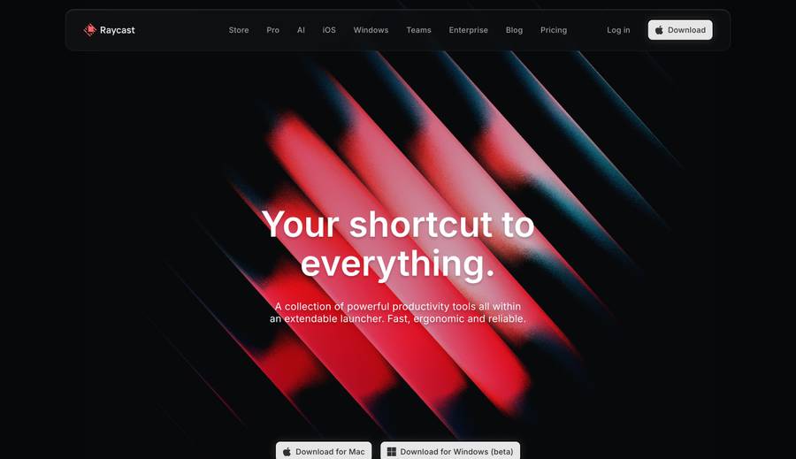
Raycast built a product for developers and designers — a power-user launcher — and the site is as fast as the product. Dark mode, dense information, extension ecosystem showcase. The site communicates that this is for people who care about keyboard shortcuts and efficiency. The brand has a cult following built largely through a polished visual identity.

Lesson: Product aesthetics reflected in site aesthetics, power-user identity signaling

Arc

14.Arc

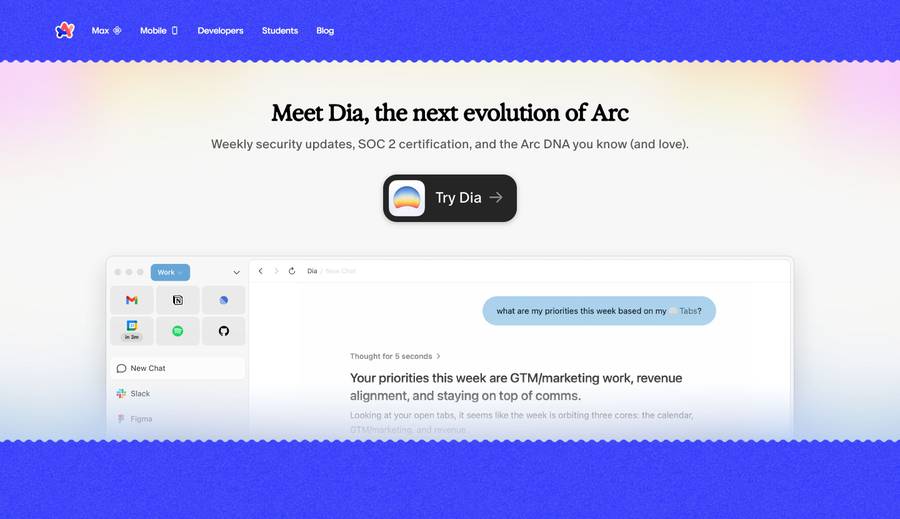
The browser that's actually for you

View on Hoverstate →

Arc bet that a browser could have a personality. The site's copywriting is informal and direct. 'Actually for you' is a pointed claim in a category where everyone claims to be user-focused. The feature tour on the homepage uses animated product shots that demonstrate the unconventional UI rather than describing it.

Lesson: Personality-forward copy in a commoditized category, animated feature tour over screenshots

Linear

15.Linear

The issue tracker for modern software teams

View on Hoverstate →

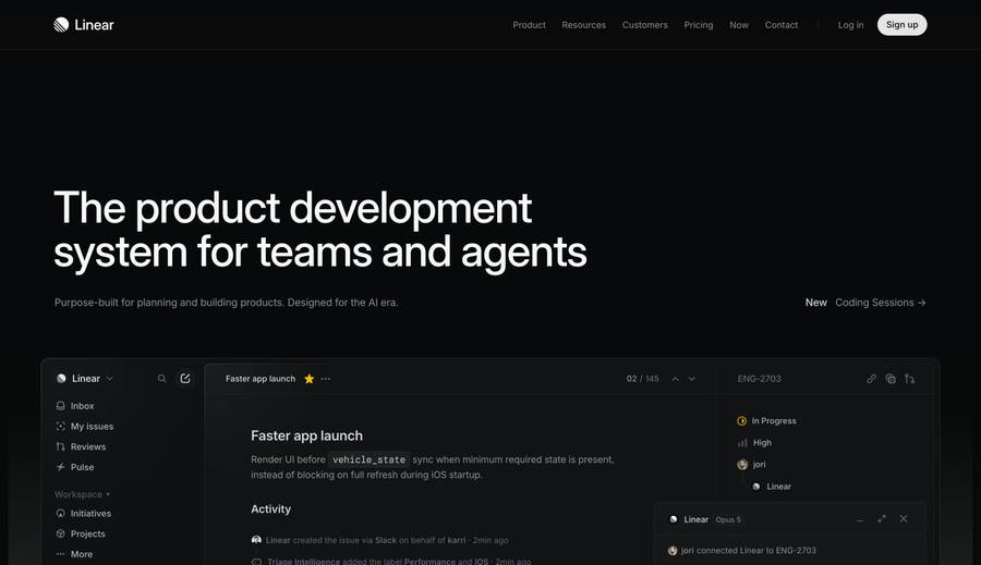
Linear's website is a startup that grew into a growth-stage company without losing its design conviction. The site has always been minimal, dark, and keyboard-focused — reflecting the product's values. The changelog and engineering blog are prominently placed: transparency as trust signal for a tool that teams depend on.

Lesson: Consistency of design conviction through growth stages, changelog as brand asset

16.Fey

Your personal finance companion

Visit →

Fey has one of the most premium-feeling personal finance app sites. The product screenshots are shown with custom lighting and depth — they look like physical objects. The site communicates that this is a product with attention to craft, which is the key differentiator in a category of utilitarian apps.

Lesson: Product screenshot presentation as brand signal — render screenshots with depth and lighting

Frequently Asked Questions

What should a startup website include?+

At minimum: a headline that states what you do in one sentence, a visual that shows the product or its output, a single CTA to start a trial or sign up, and social proof (users, customers, or a notable backer). Don't launch a features page before you've nailed the homepage — most visitors leave from the homepage. The headline is the single most important element on the page — test it before anything else. If you can't explain what you do in eight words, the problem is usually positioning, not copywriting.

How much should a startup spend on website design?+

Less than you think at the early stage. A well-copywritten Framer or Webflow template outperforms a custom-built site with weak messaging. Invest in copywriting first — the headline and subheadline on the homepage do more work than any design decision. Redesign when you have traction and know what's converting. Most successful early-stage startup sites cost under $5,000 to produce — the value comes from iteration on messaging, not from premium custom development. Save the custom build budget for when you have product-market fit and real conversion data to design around.

What's the most common startup website design mistake?+

Leading with features instead of outcomes. 'Our platform leverages AI to optimize workflows' is a feature description. 'Ship code 40% faster' is an outcome. Visitors evaluate your site in seconds — the outcome has to be clear before the scroll. The second most common mistake is too many CTAs: 'Start free trial', 'Book a demo', 'See pricing', and 'Watch video' all on the same hero compete with each other and reduce total conversion. Pick one primary CTA and make everything else secondary.

Which is better for a startup website: Webflow, Framer, or custom code?+

Framer is the fastest to ship and easiest to iterate. Webflow has a larger template marketplace and more CMS flexibility. Custom code (Next.js) gives full control but takes the longest. For most early-stage startups, Framer gets you to market fastest with professional results. Move to custom only when design needs outgrow Framer's constraints. The tipping point is usually when you need deep integration with your product's data — customer counts, live API examples, or logged-in state — at which point a Next.js site becomes more practical than fighting a no-code tool.

Where can I browse startup website designs by technology?+

Hoverstate lets you filter a gallery of real production websites by technology stack — filter by Framer, Webflow, Next.js, or other frameworks to see how startups in your space have built their sites. You can also browse by category and industry to narrow to startups similar to yours.

What design patterns should early-stage startups avoid?+

Avoid: a hero section with no product visual (abstract animations don't convert), pricing hidden behind a 'Contact us' form, a 15-item navigation bar, and social proof from press coverage alone without any customer quotes. The most overused pattern is the floating gradient blob background — it's everywhere and has lost all distinctiveness. The best early-stage sites feel direct and product-forward, like Cursor and Railway.

Related design inspiration

Browse startup websites on Hoverstate

Filter thousands of real production websites by category, industry, or technology stack. Free, no account needed.

Loading…