Create your profile, save bookmarks & likes
hoverstate.design

18 Best SaaS Website Designs in 2026

The best SaaS websites don't just look good — they sell without a sales team. This list covers 18 real production SaaS sites across developer infrastructure, productivity, design tools, and growth platforms: what each one does well and the specific design decision worth studying.

By Shahriyar Ishmam · Last updated: October 2026 · 18 sites reviewed

Infrastructure & developer tools

Stripe

1.Stripe

Financial infrastructure for the internet

View on Hoverstate →

Stripe set the template for modern SaaS design: gradient backgrounds, code samples in the hero, and documentation treated as a first-class product. The entire site — marketing, docs, dashboard — is consistent in a way few companies match. Every page feels like it was designed by the same hand.

What to study: Cross-site consistency: marketing, docs, and dashboard feel unified

Vercel

2.Vercel

Build and deploy the best web experiences

View on Hoverstate →

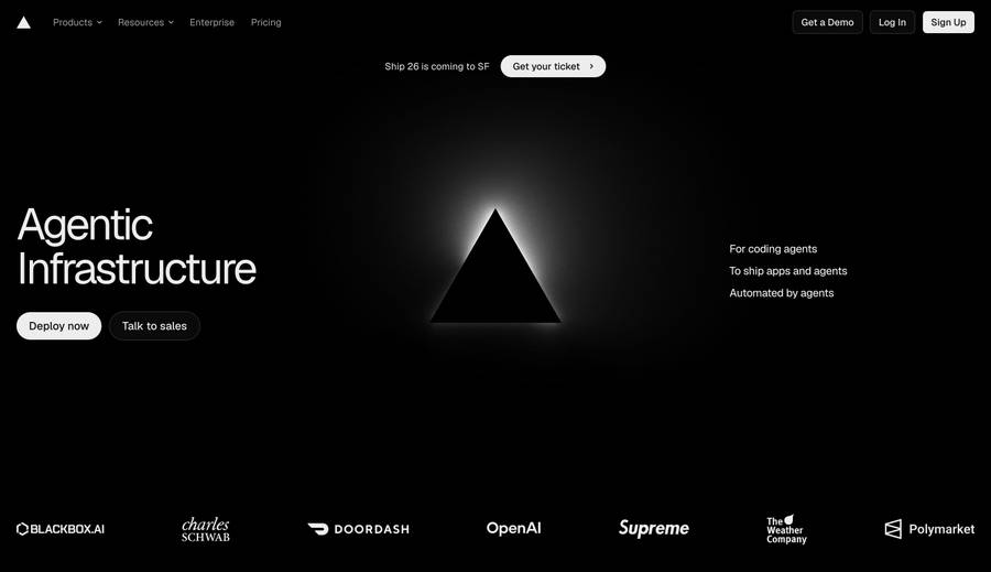
Vercel's site architecture mirrors its product: fast, dark, and technically confident. Feature pages for analytics, observability, and functions each demonstrate the product rather than describe it. The pricing page is unusually well-designed — tiers are immediately legible.

What to study: Feature pages that demonstrate, not describe; best-in-class pricing page layout

3.Supabase

Build in a weekend, scale to millions

Visit →

Supabase uses a dark, developer-first aesthetic that signals credibility in the open-source community. The site does heavy lifting with interactive demos — the dashboard preview loads in the hero. The 'Start your project' path has near-zero friction and no sales funnel.

What to study: Developer-first dark aesthetic, interactive hero demo, no-friction free tier CTA

Resend

4.Resend

Email for developers

View on Hoverstate →

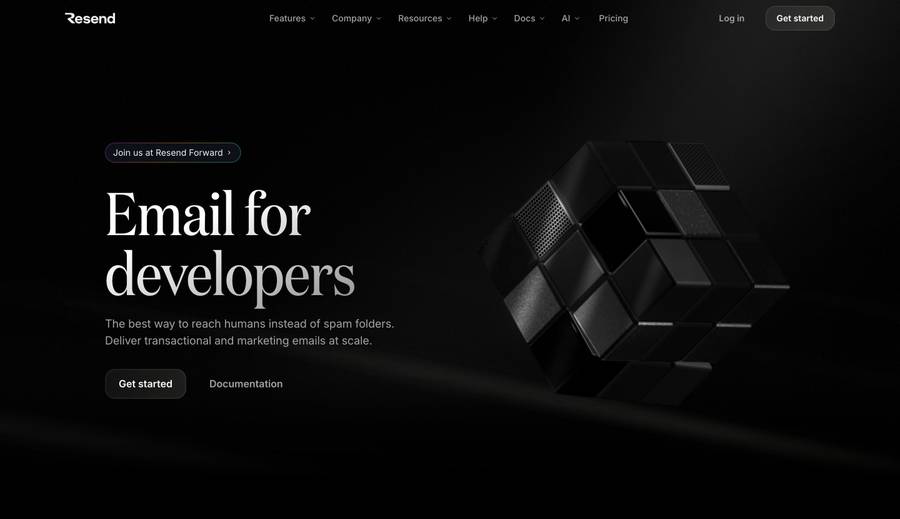
One of the cleaner SaaS websites of this generation. A single product, a single use case, one API — and the site reflects that. The pricing page is honest and frictionless. The docs link is in the main nav because developers are the customer, not an afterthought.

What to study: Radical simplicity, docs as first-class nav item, honest pricing

5.Neon

Serverless Postgres

Visit →

Neon's site commits fully to a dark visual identity with glowing UI elements that reflect the 'neon' brand name. The architecture diagram in the hero (showing branching and autoscaling) communicates the key differentiator better than a feature bullet ever could.

What to study: Brand-coherent dark aesthetic, diagram over bullet points for key features

6.Turso

The database for all things edge

Visit →

Turso leans into edge computing with a globe visualization showing distributed databases. The site is technically confident and doesn't over-explain. The SQLite compatibility badge answers the top adoption objection (migration cost) in the hero.

What to study: Edge computing globe visualization, SQLite compatibility badge as objection handler

Productivity & collaboration

7.Linear

The issue tracker for modern software teams

Visit →

Linear's website is the product's speed, translated into web design. Minimal layout, keyboard shortcuts highlighted in the copy, no marketing fluff. The changelog is promoted prominently — a trust signal that the team ships constantly. Dark by default.

What to study: Product speed reflected in site speed and design restraint, changelog as trust signal

8.Notion

Your wiki, docs, and projects — together

Visit →

Notion's site successfully sells a complex, multi-use product without overwhelming visitors. Use-case tabs segment the audience (teams, personal, students) so each sees a version of the product relevant to them. The template gallery acts as a browsable value proposition.

What to study: Audience segmentation via tabs, template gallery as discovery mechanism

Attio

9.Attio

The CRM for the next generation of companies

View on Hoverstate →

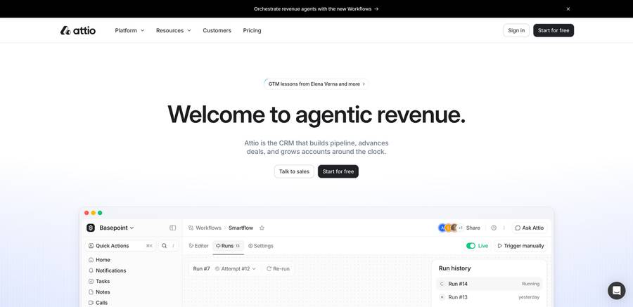
Attio targets buyers leaving Salesforce and HubSpot. The site is deliberately dense and data-rich — the UI previews show complex workspace views that signal serious capability. The positioning ('next generation') is aggressive without naming competitors.

What to study: Capability-signaling UI previews, competitive positioning without naming competitors

10.Loom

Record and share video messages

Visit →

Loom solved the classic SaaS problem of showing an intangible product: they put the video itself in the hero. A Loom recording explains Loom. The use-case split (personal vs. teams vs. enterprise) is clean, and the free tier is prominent — a direct counter to the main objection.

What to study: Product-as-hero (video about video), clear free tier, persona-based page sections

11.Cal.com

Scheduling infrastructure for absolutely everyone

Visit →

Cal.com's site uses the word 'infrastructure' deliberately — positioning scheduling as foundational software rather than a calendar tool. The open-source badge and GitHub star count appear in the nav. The site builds developer trust before it builds enterprise trust.

What to study: Infrastructure positioning, GitHub credibility signals in nav, open source trust

Pitch

12.Pitch

The collaborative presentation software

View on Hoverstate →

Pitch leads with template previews — the output, not the editor. The presentations look premium before you've seen how they're made. The collaboration angle (live cursors, comments) is shown in the product UI rather than described in a feature box.

What to study: Output-first hero (templates), collaboration shown in product UI

Design & build tools

Framer

13.Framer

The professional website builder

View on Hoverstate →

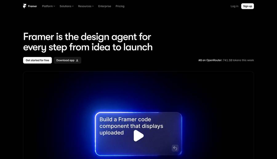
Framer's website is built on Framer, which is the ultimate product demonstration. The editor is shown open in the hero. The template gallery is browsable in-page. The site is simultaneously a marketing page and a live example of what the product produces.

What to study: Built with the product, editor-open hero, in-page template browsing

14.Webflow

Build better business websites, faster

Visit →

Webflow's site has evolved into enterprise-grade web design. The canvas preview in the hero shows drag-and-drop in action. The customer logo bar is densely packed and recognizable. Webflow also maintains a rich blog and free resources section that drives organic discovery.

What to study: Canvas drag-and-drop hero demo, enterprise logo bar, content moat

15.Figma

The collaborative interface design tool

Visit →

Figma's site is an exercise in category ownership. It doesn't need to explain what a design tool is — it shows what design looks like happening collaboratively. Multiple cursors in the hero communicate the product's core differentiator in one image.

What to study: Category ownership, multiplayer cursors as core feature visualization

Growth & creator tools

16.Beehiiv

The newsletter platform built for growth

Visit →

Beehiiv converted from a VC-backed startup to a profitable indie brand, and the site reflects that transformation. The monetization features (paid subscriptions, ad network, referrals) are front and center — the message is ROI, not publishing tools.

What to study: Monetization-first positioning, ROI quantification, creator economy framing

17.Ghost

The creator economy platform

Visit →

Ghost's open-source badge and nonprofit status are conversion weapons against Substack. The pricing page comparison table names Substack's fees explicitly. The site communicates independence and ownership, which resonates strongly with a creator audience.

What to study: Open source / nonprofit trust, explicit competitor pricing comparison, ownership framing

18.Loops

Email for modern SaaS companies

Visit →

Loops directly targets Mailchimp and SendGrid with a 'built for SaaS' message. The site shows transactional and marketing email handled in one dashboard — the key selling point over legacy tools. Clean, dark, developer-friendly design throughout.

What to study: Direct competitor displacement messaging, dual-use email dashboard hero

Frequently Asked Questions

What design patterns are common in the best SaaS websites?+

The most effective SaaS sites share: a one-sentence headline that states category and benefit, a hero that shows the product UI or a key interaction, social proof quantified with numbers, a clean pricing page with three tiers, and documentation or resources linked prominently. Dark backgrounds have become the default for developer tools. The pattern that consistently outperforms is 'show the product, not a metaphor for the product' — a real dashboard screenshot conveys more in one glance than a paragraph of feature bullets.

What makes a SaaS pricing page effective?+

The best pricing pages (Vercel, Linear, Resend) use three tiers, highlight the recommended plan, show all features without gating the comparison, and make the free tier obvious. Pricing tables that hide features behind 'contact us' buttons are a conversion killer for bottom-up SaaS. The 'most popular' label on the middle tier is a proven nudge. Showing the annual vs. monthly toggle with a visible savings percentage reduces pricing friction. A brief one-line description under each plan name that names the customer type ('For teams shipping fast', 'For enterprises with compliance needs') reduces decision paralysis.

Which SaaS website has the best overall design?+

Stripe is the most cited reference for overall SaaS website design. The combination of a polished marketing site, excellent documentation, and a consistent dashboard aesthetic — all using the same design language — is rare at Stripe's scale. Linear is the most studied for restraint and speed as brand. Vercel is the reference for developer infrastructure marketing. The choice of 'best' depends on your context: Stripe for payment or API products, Linear for productivity tools, Vercel for developer infrastructure.

Where can I find SaaS website design inspiration by technology?+

Hoverstate lets you filter the gallery by technology stack — Next.js, Framer, Webflow, and more. This means you can see how other SaaS companies using your same tech have solved design problems. Filtering by 'saas' category on Hoverstate shows hundreds of real production sites across verticals. For landing pages specifically, the Hoverstate landing pages section filters by both industry and tech stack.

How do developer-tool websites differ from regular SaaS design?+

Developer-tool websites (Stripe, Vercel, Supabase, Resend) use dark backgrounds, put code in the hero, link to documentation prominently, and use GitHub star counts and open-source badges as trust signals. They optimize for credibility over emotion. The marketing copy is terse and technical — verbose, benefit-focused copy is a negative signal to a technical audience. Pricing is always visible without requiring a sales call. The documentation is treated as a first-class marketing asset, not an afterthought.

What's the best way to study SaaS website design?+

Study the pages in context: screenshot the hero, pricing page, and one feature page of each site you admire and compare them side by side. Note specifically the headline formula, the hero visual type, and the primary CTA wording. The sites on this list represent a range of approaches rather than one template to copy. For a deeper study, browse the full gallery on Hoverstate and filter by the 'saas' category to see dozens more real examples across different verticals and price points.

Related design inspiration

Browse SaaS websites by tech stack

Hoverstate lets you filter thousands of real websites by technology — see every site built with Next.js, Framer, Webflow, or Shopify.

Loading…