Create your profile, save bookmarks & likes
hoverstate.design

12 Best OG Image Examples in 2026

OG images are the first visual impression of your site in every social share, Slack message, and link preview. Yet most sites treat them as an afterthought. These examples from real production sites cover four approaches — minimal brand identity, identity-forward branded, dynamic per-page generation, and animated GIFs — with analysis of when each works.

By Shahriyar Ishmam · Last updated: October 2026 · 12 examples analyzed

Minimal & brand-first

Resend OG image

1.Resend

Email API for developers · Monochromatic minimal

View on Hoverstate →

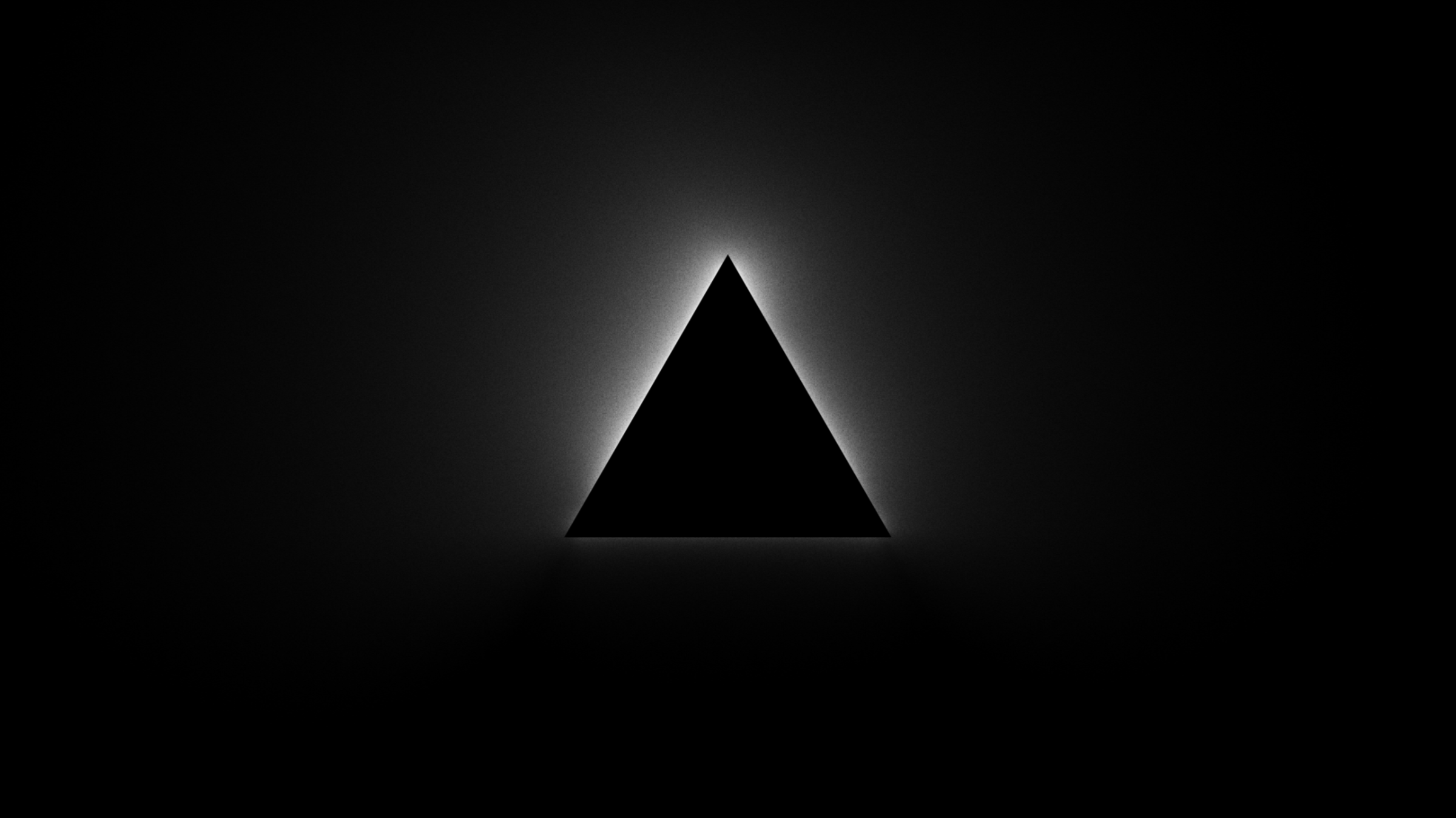
Near-black background, product name in white — nothing else. Radical restraint that matches the brand's entire identity. In a feed of gradient-heavy OG images, the plainness is itself distinctive. Works because the Resend brand is confident enough to not need decoration.

Technique: Radical restraint — minimal OG matches minimal brand identity
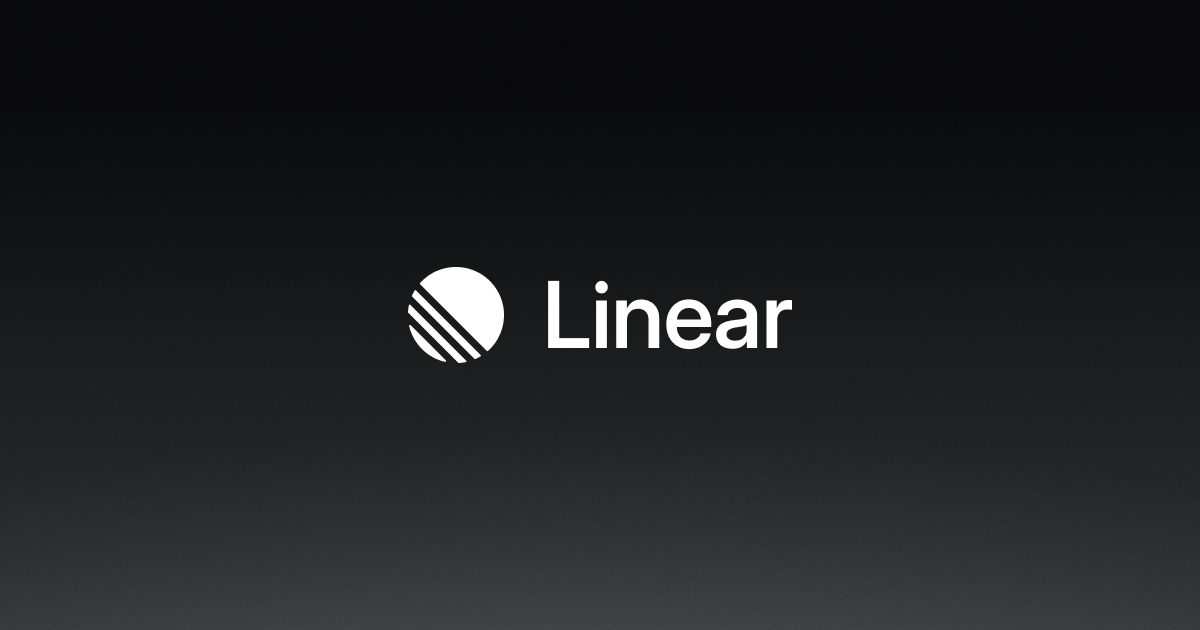
Linear OG image

2.Linear

Project management SaaS · Clean dark branded

View on Hoverstate →

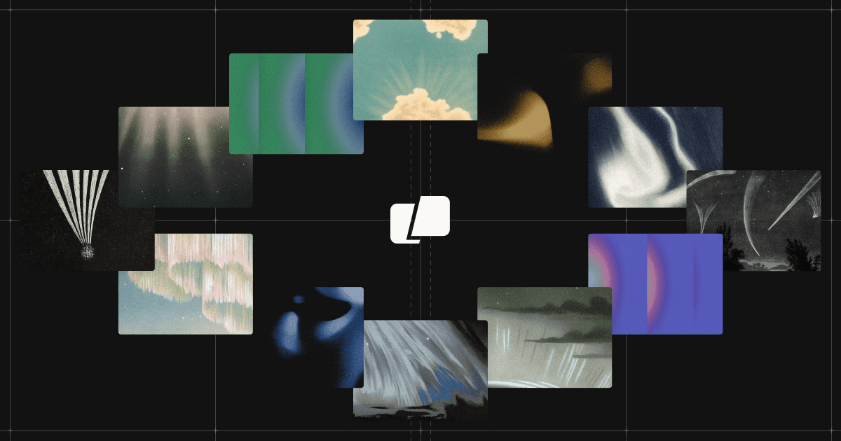
Logo centered on a clean dark background with a subtle gradient. No product screenshots, no tagline. Relies entirely on brand recognition. The restraint is appropriate — Linear is a beloved brand and the logo alone carries the signal. A minimal OG image is a bet that your brand can carry the weight.

Technique: Brand-recognition OG — works only when the brand itself has reach

Branded with identity

Warp OG image

3.Warp

AI terminal · Dark branded default

View on Hoverstate →

Dark background with the Warp logo and a short tagline. Clean and consistent with the developer-tool aesthetic. Not trying to show product UI — the brand and category are enough to qualify the click from a developer audience that already knows what a terminal is.

Technique: Category + brand on dark — efficient for developer tools with known categories

Arc OG image

4.Arc

Browser · Personality-forward branded

View on Hoverstate →

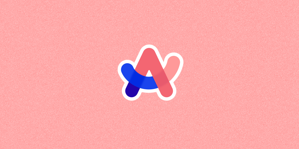
Arc's OG image has color and personality — consistent with a browser that is trying to feel different from Chrome and Safari. The visual identity in the OG image is as distinctive as the product itself. When your product is a personality play, your OG image should have personality too.

Technique: OG image as personality signal — brand identity before product description

Raycast OG image

5.Raycast

macOS launcher · Dark with brand accent

View on Hoverstate →

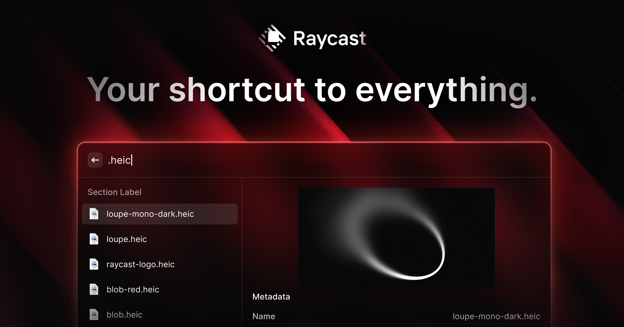
Dark background with Raycast's pink/red brand accent. The contrast between the dark field and the accent color makes it immediately identifiable in a feed. Developer-tool dark mode + one strong accent color is a well-executed OG pattern — it requires no explanation for the target audience.

Technique: Dark + single strong accent — high recall at thumbnail size for known brands

Dynamic & content-generated

Vercel OG image

6.Vercel

Deployment platform · Dark gradient with text

View on Hoverstate →

Dark navy gradient that shifts from the hero's color palette into the OG image. Vercel generates these dynamically for different pages — deployment pages, docs, blog posts — each with the page title rendered large. In a light-mode Twitter/X feed, a dark OG image pops against white backgrounds. Their og library became a standard for the Next.js ecosystem.

Technique: Dynamic generation with page title large at thumbnail scale, dark on light feed contrast

Stripe OG image

7.Stripe

Payments infrastructure · Gradient with page title

View on Hoverstate →

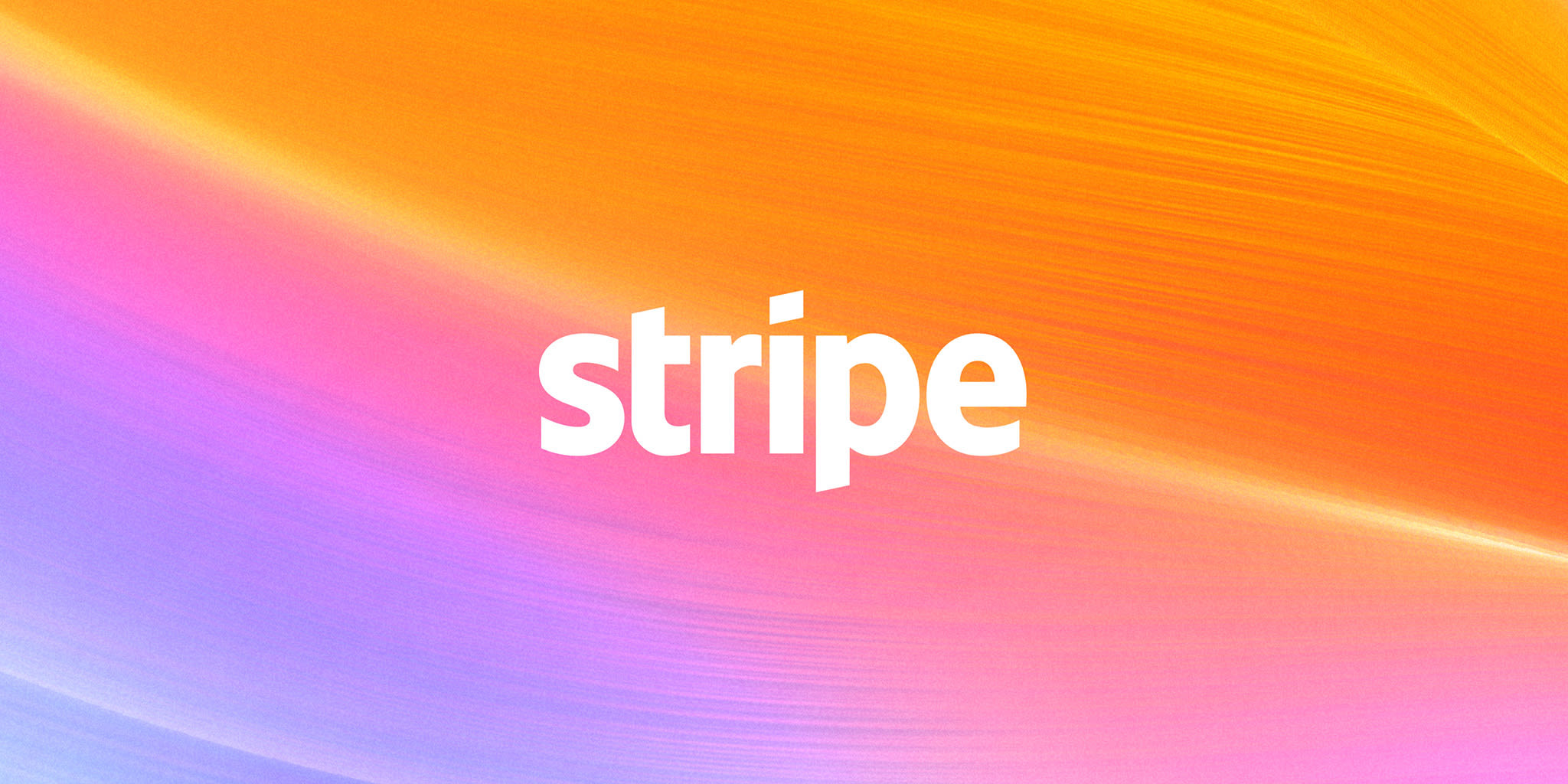
Stripe generates OG images that use the brand gradient as background and render the page title prominently. Documentation pages show the article title large enough to read at the small preview size on Twitter/X. The gradient reinforces the Stripe identity at a glance. Every shared Stripe link is consistent and branded.

Technique: Page title legible at thumbnail size, brand gradient as instant recognition

Cal.com OG image

8.Cal.com

Scheduling platform · User-generated booking card

View on Hoverstate →

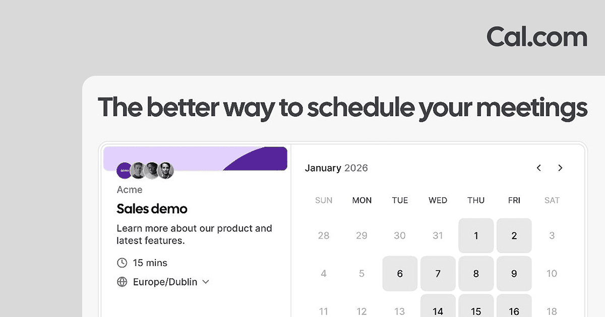
Cal.com generates personal booking page OG images with the user's name, avatar, and a 'Book a meeting' call-to-action. When users share their Cal links on social media, the OG image is a personalized conversion card. The platform's brand is secondary — the sharer's identity is primary. The OG image does active conversion work rather than passive brand signaling.

Technique: OG as conversion asset — personalized to the sharer, not the product brand

Pitch OG image

9.Pitch

Collaborative presentation tool · Template screenshot preview

View on Hoverstate →

Pitch's OG image shows a rendered preview of a presentation — the output, not the editor. When someone shares a Pitch link, the preview gives an accurate sense of what clicking will deliver. In a text-heavy feed, a full-design screenshot OG image is visually distinctive.

Technique: Product output as OG preview — quality of output sells the product before the click

Attio OG image

10.Attio

CRM platform · Dense UI preview

View on Hoverstate →

Attio's OG image shows a portion of the product UI — dense, data-rich, clearly a serious tool. For a CRM targeting buyers moving off Salesforce, a complex UI screenshot signals capability. The OG image pre-qualifies the audience: if the dense view looks appealing, you're the right customer.

Technique: UI complexity as self-qualification — sophisticated OG image selects for the right buyer

Animated GIFs

Superhuman OG image

11.Superhuman

Email client · Animated GIF with branding

View on Hoverstate →

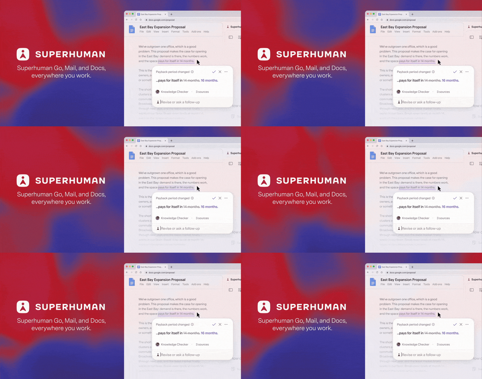
Superhuman uses an animated GIF as its OG image — a loop that communicates motion and energy before a single pixel of the site loads. GIF OG images play automatically in Slack, iMessage, and some social previews. The animation creates a premium, premium-feels-alive impression that a static image cannot match.

Technique: Animated GIF OG — motion communicates energy in Slack/iMessage previews

Basement Studio OG image

12.Basement Studio

Creative development studio · Animated dark studio brand

View on Hoverstate →

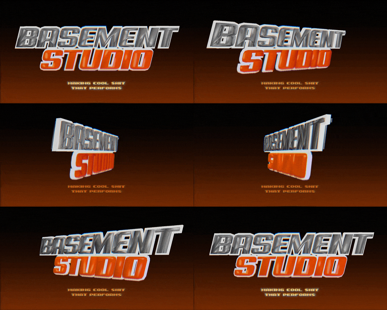
Basement's OG image is an animated GIF with the studio's industrial-gritty dark aesthetic. For a creative studio, the OG image IS the pitch — it has to show the visual identity immediately. The animation and texture communicate 'we make things that move and feel crafted,' which is exactly what their clients are buying.

Technique: Animated GIF for creative studios — the motion is the portfolio teaser

Frequently Asked Questions

What is an OG image?+

An OG image (Open Graph image) is the preview image that appears when a URL is shared on Twitter/X, LinkedIn, Slack, iMessage, or any platform that reads Open Graph meta tags. It is set with the <meta property="og:image"> tag. The recommended size is 1200×630px. Without an OG image, platforms use a generic thumbnail or blank preview. OG images are the single most impactful metadata element for social share click-through rates — a well-designed OG image can meaningfully increase the percentage of people who click a link when they see it in a feed.

What makes a good OG image?+

A good OG image is: legible at small thumbnail sizes (test at 500px wide), consistent with the page content it represents, fast to load (keep under 200KB if possible for static; GIFs can be larger), and distinct enough to stand out in a feed of other links. Text should be at least 24px in the final 1200×630 image to remain readable at thumbnail scale. The most common mistake is designing OG images at full resolution without testing them at the 250–400px width where they actually appear in feeds. A design that looks great at 1200px can become unreadable at 300px.

Should OG images be dynamic or static?+

It depends on the content. Static OG images work for marketing pages where the content doesn't change. Dynamic OG images (generated per-page with the page title, author, or content) dramatically increase click-through for content-heavy sites like blogs, docs, and user-generated content platforms. Vercel's og library and Satori are standard tools for generating dynamic OG images in Next.js. The strongest signal for going dynamic is when your users share individual content pages — blog posts, profile pages, product listings — rather than just your homepage.

What size should an OG image be?+

1200×630px is the standard recommended size. Twitter/X crops to a 2:1 ratio (1200×600), so design with content in the center and avoid important elements within 15px of the bottom edge. Facebook and LinkedIn use 1200×630 without cropping. Some platforms (Discord, Slack) crop to square — keep the core content in the center 600×600 zone if you want to support all platforms. Always set both og:image and twitter:image in your metadata since Twitter/X uses its own tag and may not fall back to og:image reliably.

How do I generate OG images in Next.js?+

Next.js 13+ supports automatic OG image generation via the ImageResponse API in opengraph-image.tsx files. You write a React component that renders the image, and Next.js generates a PNG at build time or on demand. The next/og package powers this. For custom fonts and complex layouts, use the Satori library directly. The file-based approach (placing opengraph-image.tsx inside a route folder) is the simplest path — it automatically associates the generated image with the correct route and sets all the required meta tags.

Where can I find OG image inspiration?+

Hoverstate has a dedicated OG images section — a gallery of OG images from real production websites, browsable for patterns and styles. It is one of the only galleries curating OG image design specifically rather than full-page screenshots. For dark-mode OG image inspiration, the dark mode websites roundup covers several sites (Raycast, Linear, Vercel, Resend) whose OG images are directly related to their dark brand identity.

Related design inspiration

Browse the full OG image gallery

Hoverstate has a dedicated OG images section — one of the only galleries curating Open Graph image design specifically. Browse hundreds of real OG images from production sites.

Loading…