What makes a landing page high-converting?+
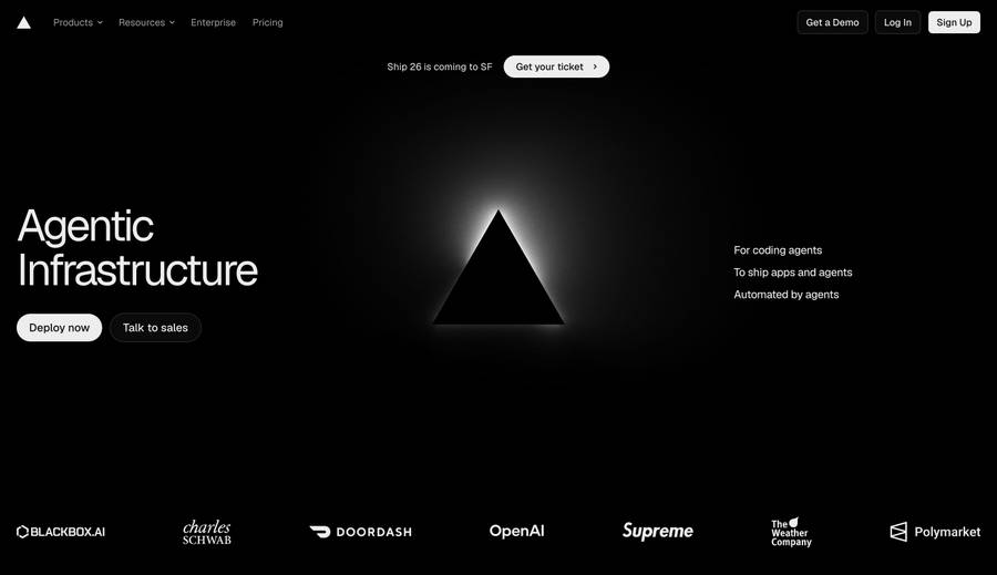
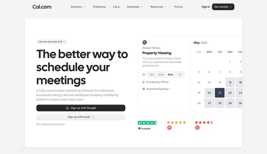
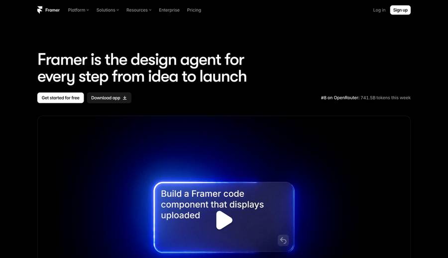
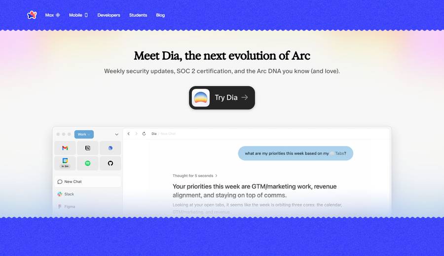
The most effective landing pages share five elements: a headline that states the value proposition in one sentence, a hero visual that shows the product or outcome (not an abstract illustration), a single primary CTA, social proof above the fold, and fast load time. Restraint is as important as content — every element that doesn't support the conversion decision is a distraction. Pages that score highest in A/B tests tend to remove options, not add them. A single clear path to conversion consistently outperforms pages with multiple competing calls to action.
What's the best landing page design for a SaaS product?+
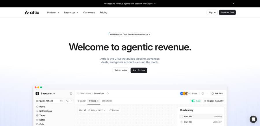
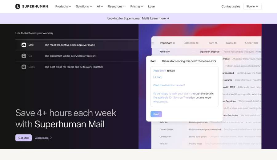
For SaaS, the most effective pattern is: category + benefit headline, dashboard screenshot or interactive demo in the hero, quantified social proof (number of teams, users, or transactions), pricing or 'start free' CTA, and a FAQ section. Linear and Stripe are the two most-studied references in B2B SaaS. Both use extreme restraint — Linear with a single screenshot and whitespace, Stripe with a developer-focused code preview. Avoid long feature grids above the fold; the hero should answer 'what is this and why should I care' in under five seconds.
How do developer tool landing pages differ from regular SaaS?+
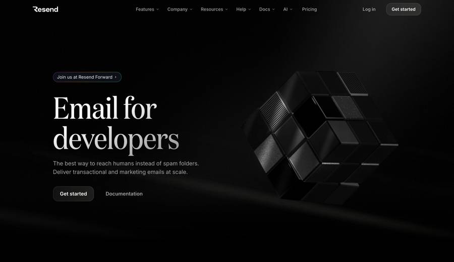
Developer tool landing pages (Stripe, Resend, Neon, Supabase) put code in the hero. A working code block in the viewport signals 'this product respects developers' more than any marketing copy. They also lead with documentation links and open-source badges rather than testimonial carousels. Pricing is shown directly — developers distrust sites that hide it. The copy is terse and technical by design: developer audiences treat excessive marketing language as a negative trust signal.
Where can I browse real landing page examples by category?+
Hoverstate has a dedicated landing pages section with technology-stack filtering — you can see which landing pages were built with Webflow, Framer, Next.js, and more. Lapa Ninja and Land-book are also focused galleries of landing page inspiration. For specific industries, searching Hoverstate by category (SaaS, startup, agency, ecommerce) surfaces the most relevant examples faster than browsing generalist galleries.
Should a landing page have navigation?+
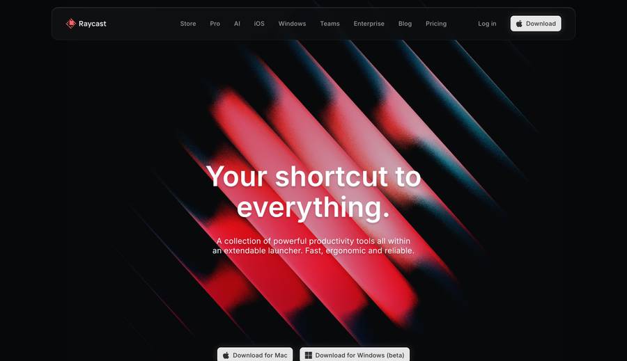
For dedicated conversion campaigns (ads, email), remove the nav — every external link is a leak. For homepage-style landing pages where organic discovery is the channel, keep a minimal nav. The examples in this list are mostly marketing homepages with simplified navs rather than fully stripped campaign pages. A good rule: if the page has a paid traffic source, strip the nav and test. If it relies on SEO and word of mouth, a minimal nav helps users orient themselves and explore related pages.
What's the ideal hero section for a landing page?+
The ideal hero answers three questions immediately: what is this, who is it for, and what do I do next. The headline states the category and primary benefit. The sub-headline handles the 'who is it for' qualifier. The CTA is a single button. The visual — screenshot, animation, or illustration — should show the product output rather than represent it abstractly. Pages that show a dashboard, a generated result, or a working demo outperform pages that show a generic illustration of 'productivity' or 'growth.'