Create your profile, save bookmarks & likes
hoverstate.design

12 Best Dark Mode Website Designs in 2026

Dark mode is now the default for developer tools and a strong signal of quality for many SaaS products. But dark mode done wrong is harsh, muddy, or generic. These 12 examples from SaaS products, developer tools, portfolios, and creative studios each demonstrate a specific dark UI technique worth studying.

By Shahriyar Ishmam · Last updated: October 2026 · 12 sites reviewed

SaaS products

Linear

1.Linear

Project management SaaS

View on Hoverstate →

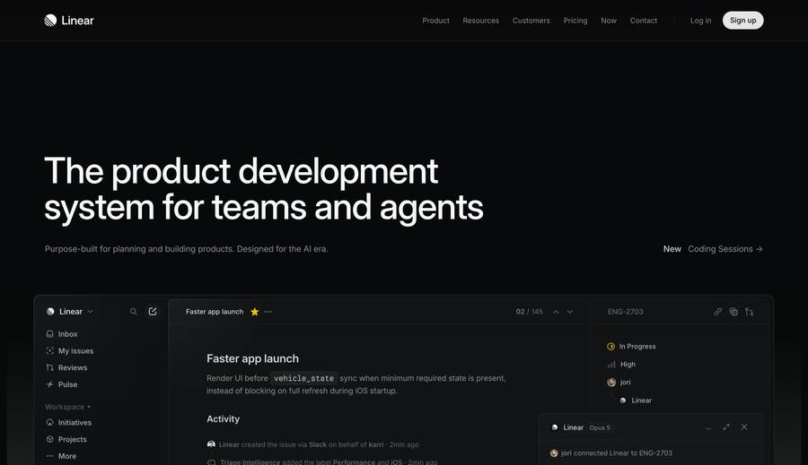
Linear is the benchmark for dark mode SaaS design. The near-black background (#0F0F12 range) uses very little pure black, creating depth through layering rather than contrast alone. UI elements are lit from above — a subtle gradient at the top of cards simulates ambient light. The result is dark but never harsh.

Technique: Near-black (not pure black), layered depth, ambient light simulation on UI surfaces
Developer tools

Vercel

2.Vercel

Deployment platform

View on Hoverstate →

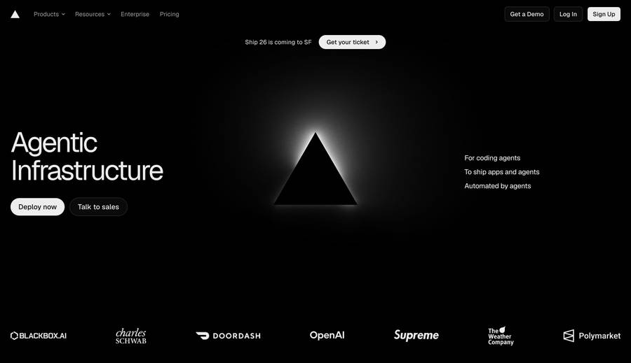
Vercel's dark site uses a gradient background that shifts from near-black to dark navy. Text glows at full white (#FFFFFF) for primary content, stepping down to grey for secondary. The gradient blobs in the hero introduce color without saturating the page. One of the most-copied dark-mode marketing page patterns.

Technique: Dark navy gradient background, white/grey text hierarchy, color through gradient blobs

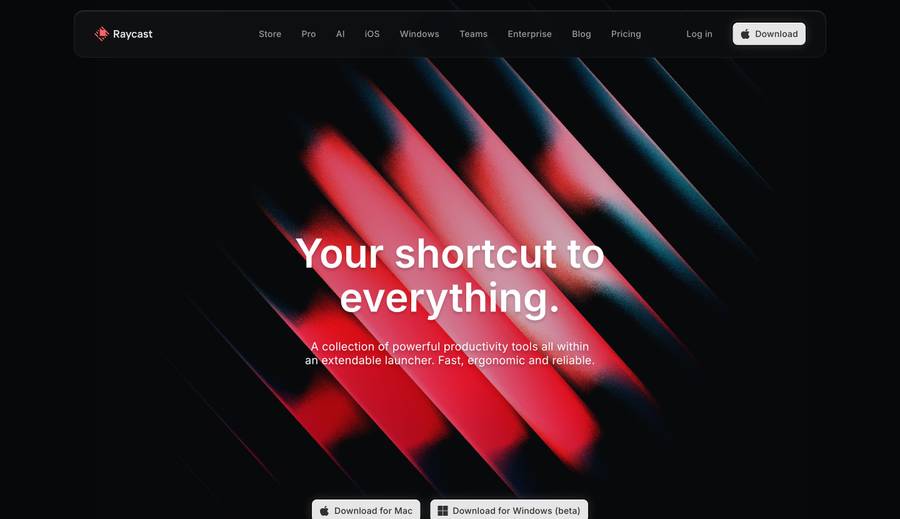
Raycast

3.Raycast

macOS launcher app

View on Hoverstate →

Raycast's dark design is dense and precise — it mirrors the product's own UI. The site uses color sparingly: a pink/red accent for brand moments, grey-on-dark for supporting content. The product screenshots are composited into dark backgrounds with matching depth, making the screenshots feel native to the page.

Technique: Brand accent used sparingly, screenshot compositing against matching dark backgrounds

4.Supabase

Open source backend platform

Visit →

Supabase uses dark mode with green (#3ECF8E) as its primary brand color — a pairing that gives it immediate visual identity in a category of blue-heavy competitors. The terminal-green accent signals developer credibility. Code blocks use a slightly lighter dark than the background, separating them without adding a border.

Technique: Terminal-green accent on dark for immediate developer brand identity, code block depth trick

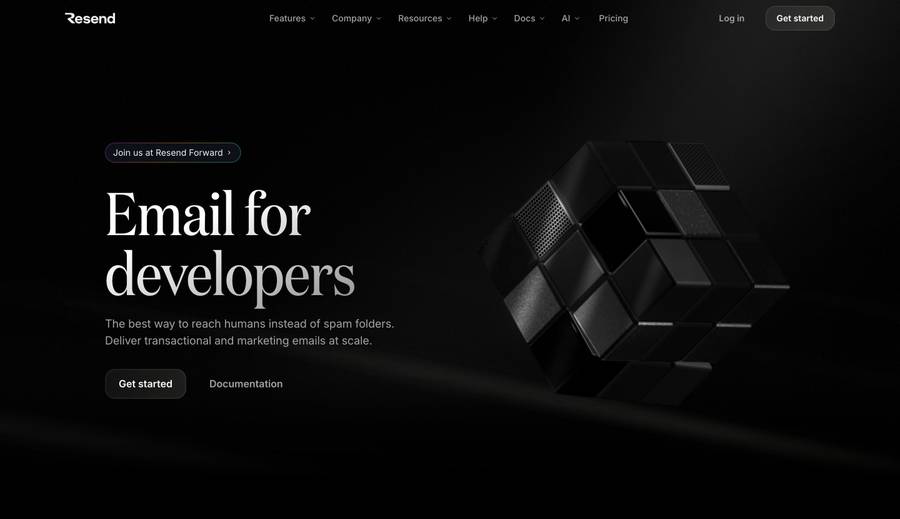
Resend

5.Resend

Email API for developers

View on Hoverstate →

Resend's dark site is almost monochromatic — black, dark greys, and white text with minimal accent color. The effect is clean and confident, appropriate for a product that positions itself on simplicity and reliability. A white primary CTA button on a black background is the highest-contrast CTA pattern possible.

Technique: Near-monochromatic dark palette, maximum contrast CTA, restraint as brand signal

6.Cursor

AI code editor

Visit →

Cursor's site matches the dark editor environment that developers live in. The hero video shows the editor open with dark syntax highlighting — a dark site previewing a dark product. The few moments of color (purple/blue accents for AI features) are intentional rather than decorative.

Technique: Dark site mirrors dark product context, intentional accent color for AI feature moments

Portfolios

7.Rauno Fäderholm

Design engineer portfolio

Visit →

A minimalist dark personal site from Vercel's design team. The dark background is warm-tinted rather than cool — a subtle detail that makes the reading experience more comfortable than a cold pure-black background. Hover states throughout the site are crafted with the same precision as the product work he's known for.

Technique: Warm-tinted dark background for comfortable reading, precision hover states as portfolio proof

8.Paco Coursey

Developer portfolio

Visit →

Paco's dark site is deceptively simple. The background is not pure black — it's a very dark grey with a slight warm cast. Typography is the only design element. The famous dark mode toggle animation he built became widely copied and demonstrates that interaction quality can be a portfolio piece.

Technique: Near-black warm grey, typography-only design, interaction as portfolio statement

Creative studios & galleries

9.Dark Mode Design

Dark mode gallery

Visit →

A gallery dedicated entirely to dark mode websites — an obvious reference if you are building in dark mode. The site itself is dark, making it a self-referential example. Useful for studying the range of approaches: from high-contrast to muted, from minimal to saturated.

Technique: Dedicated dark mode reference gallery — browse for palette and contrast range

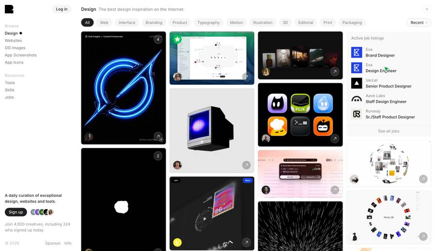
Godly

10.Godly

Design inspiration gallery

View on Hoverstate →

Godly curates dark-mode-heavy sites with an editorial eye. The gallery interface itself is dark, making the featured sites render more accurately than on a white-background gallery. A strong source for studying motion-heavy and typographic dark mode work.

Technique: Dark gallery interface preserves dark site colors, editorial curation skews dark and typographic

11.Lusion

Creative development studio

Visit →

Lusion's studio site is a showreel of WebGL and Three.js work displayed against a deep black. The dark background maximizes the visual impact of neon and light-emitting effects in their work. Agency and studio sites use dark mode specifically to make interactive experiments pop.

Technique: Deep black as stage for light-emitting effects, dark background maximizes WebGL contrast

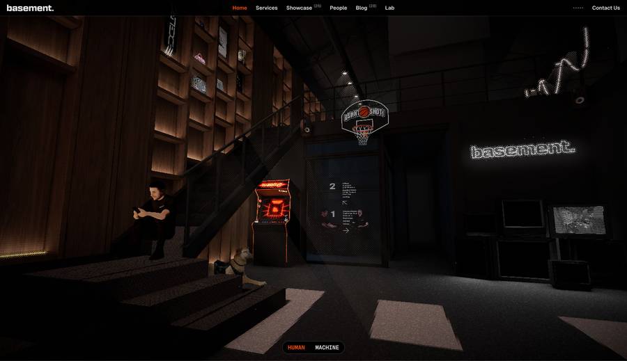
Basement Studio

12.Basement Studio

Creative development studio

View on Hoverstate →

Basement uses a near-black with red/orange accents — one of the more distinctive dark palettes among creative studios. The gritty, industrial aesthetic is consistent across the site and their client work. A useful example of dark mode with strong color identity beyond the typical blue-or-purple default.

Technique: Red/orange accent on dark for industrial brand identity, dark mode as aesthetic commitment not default

Frequently Asked Questions

What are the best practices for dark mode website design?+

Never use pure black (#000000) as your background — it creates harsh contrast. Use near-black (e.g., #0D0D0D to #1A1A1A) with a slight warm or cool tint. Step your text down: primary text at full white, secondary at 60–70% opacity, tertiary at 40%. Use color sparingly — one accent color at most. Test on OLED screens where pure black pixels turn off entirely. Also test in a bright environment — dark mode sites that look great in a dim room can look washed out on a laptop in daylight.

Should a SaaS product default to dark mode?+

Only if dark mode is authentic to your product and audience. Developer tools (Raycast, Linear, Vercel) use dark mode because their users live in dark terminals and editors. Consumer products (Notion, Loom) typically default to light with a dark mode option. A dark default for a productivity tool targeting non-technical users can feel heavy and uninviting. The safest approach for most SaaS products is to offer both and respect the OS preference using prefers-color-scheme — but don't split your design time equally between them at launch.

What text colors work best on dark backgrounds?+

Pure white (#FFFFFF) for primary headings and CTAs. Around 70% opacity white (#B3B3B3 range) for body text — slightly softer than pure white reduces eye strain. 40–50% opacity for secondary labels and metadata. Avoid off-white with a strong yellow or blue tint unless it's an intentional brand decision. Always check WCAG contrast ratios — AA requires 4.5:1 for normal text, 3:1 for large text. A 60% opacity white on a dark background often fails AA for body text sizes, so test with a contrast checker before shipping.

What's the best background color for a dark mode website?+

Most successful dark mode sites use backgrounds in the #0D0D0D–#1C1C1E range rather than pure black. A slight warm tint (e.g., #111111 with red channel slightly boosted) is more comfortable for extended reading than a cool grey or pure black. Linear's near-black is one of the most-referenced implementations. For marketing pages specifically, a very dark navy (e.g., #0A0A14) can feel premium without feeling as stark as pure black — Vercel uses this approach effectively.

Where can I find more dark mode website inspiration?+

Dark Mode Design is a dedicated gallery. Godly curates motion-heavy and typographic sites with many dark examples. Hoverstate's gallery includes many dark mode sites across SaaS, portfolios, and creative studios. For portfolio-specific dark mode inspiration, the portfolio websites roundup page covers several personal sites that execute dark mode with craft — Rauno Fäderholm and Paco Coursey are the most-studied examples.

How do dark mode OG images differ from light-mode OG images?+

Dark mode OG images pop in light-mode social feeds (Twitter/X, LinkedIn) because of the contrast inversion — a dark card stands out against a white feed background. This is a secondary benefit of building a dark brand. The tradeoff is that dark OG images can feel heavy in dark-mode social clients. Vercel's og library generates dark OG images that read well in both contexts by keeping the brand gradient saturated enough to remain recognizable.

Related design inspiration

Find dark mode inspiration on Hoverstate

Browse thousands of real websites including many dark mode examples — filterable by technology, category, and industry.

Loading…